Superposition of two sine waves
Filed in Maths, ILT on March 27th 06 .
You can use a simple MS Excel spreadsheet to illustrate the effect of adding two sine waves with various amounts of phase shift between the waves. Using a scroll bar allows a degree of interaction, although the way the scroll bar control works in MS Excel is not good for interactive graphs – you have to adjust the slider and let go before the spreadsheet recalculates to show the effect of the change.
- Download the MS Excel spreadsheet 148 Kb, Excel 2004 but compatible with Excel 1997+
- FERL video by Alistair McNaught on how to link a scroll bar to a cell value in Excel
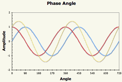
The blue trace is the original sine wave, the red trace is the phase shifted sine wave (both of amplitude 1) and the yellow trace is the superposition of the two waves. The graph extends over two cycles (720 degrees) and the phase shift slider allows phase shifts between 0 and 360 degrees. Rescaling the spreadsheet for Radians would be the work of minutes.
This is filed under Maths, ILT. You can follow any responses to this entry through the RSS 2.0 feed. Both comments and pings are closed for this post.
[ bodmas home ]

-
Bodmas features
- RBL Wikispace
- Moodle
- E-learning notes
-
Pages
-
Categories
-
Recent posts
-
Archives
- October 2006
- September 2006
- August 2006
- July 2006
- June 2006
- May 2006
- April 2006
- March 2006
- February 2006
- January 2006
- December 2005
- November 2005
- October 2005
- September 2005
- August 2005
- July 2005
- June 2005
- May 2005
- April 2005
- March 2005
- February 2005
- January 2005
- December 2004
- November 2004
- October 2004
-
Blackboard and DOPA
- Another patent...
- AoC on DOPA
- BECTa advice
- History of VLEs
- Michael Feldstein's blog
-
ILT
- All Things Wiki
- Andy's Black Hole
- Blog Technology blog
- Clive on Learning
- Dick Willis
- EdTechUK
- edugeeks
- FERL @ BECTa
- Fordlog
- Full circle online interaction blog
- Jane's e-learning pick of the day
- Mac OS X tips
- Moodle Training Blog
- moodle.org
- Moodlebug
- MoodleMoot UK
- Open Source Web Design
- Podcasting in Ireland
- Presentation Zen
- Seb Schmoller
- wikispaces
- Yotophoto
-
Journalist Blogs
- Bill Thompson
- BuzzMachine
- Healing Irag
- Kieren McCarthy
- Roy Greenslade
-
Maths
- 2nd July
- Artifacts of Computation
- Blogging for Numeracy
- Casting out nines
- Cut the Knot
- Dotty paper
- Gallery of Computation
- Mathworld
- Numeracy for Health
- Skills Workshop
- Special Graph paper grids
- The Geometry Junkyard
-
Misc
- A Few Things Ill Considered
- Bartleby reference
- BBC Learning Styles survey
- Explorations in Learning
- G24
- Overgrown Path
- Primary Teacher UK
- Real Climate
- UK Phenology Network
- Ways of Knowing
- Wikipedia (English)
- WordPress
-
Playtime
- 55 Ways to Have fun with Google
- GUI Gallery
- Guido Fawkes
- Hitchhiker's Moon
- Inconstant Moon
- Kiev Ephemeris
- Magnatune
- Penny Illustrated News
- Post-Modern generator
- Project Redsand
- Sofa Sound
- Spell with Flickr
- Think Link
- Waterfall 2006
- Wordcount
-
Vital software
- Audacity
- Audio Hijack
- AVG virus checker
- ClamXav
- Disable spotlight
- EasyWMA
- Express Scribe
- LaTeX Equation Editor
- Mellel
- Open Office
- PDFLab
- Processing 1.00 [ beta ]
- Seamonkey
- Smultron
- ST 330 drivers
- Stuffit expander
- Tinderbox
- Vienna RSS reader
- Writeroom
-
Web applications
- Remember the milk
- Resize pictures on the Web
- ScanR
- Score your password
-
Themes
-
Meta
- Login
- XFN
- WordPress
-
Tags
- maths+resources
- maths+teaching
- elearning

![]()
Site delivered by WordPress
© Content Keith Burnett, 2006. This old school table-based layout was devised to support a Web authoring module. Mind you, it loads quicker than Kubrick in Safari...