Pie charts
Filed in Maths, ILT on December 4th 05 .
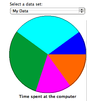
Both GCSE and Access Maths are moving into basic charts – and there is also coursework that requires students to write about what the graphs mean. I had a laptop and projector set up with Excel running. I typed in some data for a pie chart – and used the Chart Wizard to draw the chart. The students drew a chart based on the same data and compared their drawings with the projected image – caught a few mistakes that way while I went around and helped position the protractors.
Then I asked questions about the relative sizes of the sectors – is this sector twice the size of that one or nearer three times the size? – Which sector is the largest? How big is the second largest in relation to the largest; half the size? a quarter of the size? Guess the percentages in each sector! Finally, I had data with two columns and asked students to compare the relative proportions or percentages of each sector. I then used the Chart Wizard to redraw the graphs as a comparative percentage bar chart – much easier!
All this could have been accomplished with handouts, OHPs, PowerPoint presentations or sketches on the whiteboard but using Excel interactively saved a shed load of time and allowed me to alter the data on the fly and answer questions with examples.
The Shodor Foundation makes a range of interactive Java applets available for use from their Web server (no download for Intranets alas)
- Type your data in and plot the result Java applet – type your numbers and the labels and the applet plots the results. Could replace Excel in the activity above
- Fractions and percentage draggable pie chart Java applet – you drag sliders to change proportions or drag the ‘handles’ on the sectors to change the angles
- Other statistics applets from the site
This is filed under Maths, ILT. You can follow any responses to this entry through the RSS 2.0 feed. Both comments and pings are closed for this post.
[ bodmas home ]

-
Bodmas features
- RBL Wikispace
- Moodle
- E-learning notes
-
Pages
-
Categories
-
Recent posts
-
Archives
- October 2006
- September 2006
- August 2006
- July 2006
- June 2006
- May 2006
- April 2006
- March 2006
- February 2006
- January 2006
- December 2005
- November 2005
- October 2005
- September 2005
- August 2005
- July 2005
- June 2005
- May 2005
- April 2005
- March 2005
- February 2005
- January 2005
- December 2004
- November 2004
- October 2004
-
Blackboard and DOPA
- Another patent...
- AoC on DOPA
- BECTa advice
- History of VLEs
- Michael Feldstein's blog
-
ILT
- All Things Wiki
- Andy's Black Hole
- Blog Technology blog
- Clive on Learning
- Dick Willis
- EdTechUK
- edugeeks
- FERL @ BECTa
- Fordlog
- Full circle online interaction blog
- Jane's e-learning pick of the day
- Mac OS X tips
- Moodle Training Blog
- moodle.org
- Moodlebug
- MoodleMoot UK
- Open Source Web Design
- Podcasting in Ireland
- Presentation Zen
- Seb Schmoller
- wikispaces
- Yotophoto
-
Journalist Blogs
- Bill Thompson
- BuzzMachine
- Healing Irag
- Kieren McCarthy
- Roy Greenslade
-
Maths
- 2nd July
- Artifacts of Computation
- Blogging for Numeracy
- Casting out nines
- Cut the Knot
- Dotty paper
- Gallery of Computation
- Mathworld
- Numeracy for Health
- Skills Workshop
- Special Graph paper grids
- The Geometry Junkyard
-
Misc
- A Few Things Ill Considered
- Bartleby reference
- BBC Learning Styles survey
- Explorations in Learning
- G24
- Overgrown Path
- Primary Teacher UK
- Real Climate
- UK Phenology Network
- Ways of Knowing
- Wikipedia (English)
- WordPress
-
Playtime
- 55 Ways to Have fun with Google
- GUI Gallery
- Guido Fawkes
- Hitchhiker's Moon
- Inconstant Moon
- Kiev Ephemeris
- Magnatune
- Penny Illustrated News
- Post-Modern generator
- Project Redsand
- Sofa Sound
- Spell with Flickr
- Think Link
- Waterfall 2006
- Wordcount
-
Vital software
- Audacity
- Audio Hijack
- AVG virus checker
- ClamXav
- Disable spotlight
- EasyWMA
- Express Scribe
- LaTeX Equation Editor
- Mellel
- Open Office
- PDFLab
- Processing 1.00 [ beta ]
- Seamonkey
- Smultron
- ST 330 drivers
- Stuffit expander
- Tinderbox
- Vienna RSS reader
- Writeroom
-
Web applications
- Remember the milk
- Resize pictures on the Web
- ScanR
- Score your password
-
Themes
-
Meta
- Login
- XFN
- WordPress
-
Tags
- maths+resources
- maths+teaching
- elearning

![]()
Site delivered by WordPress
© Content Keith Burnett, 2006. This old school table-based layout was devised to support a Web authoring module. Mind you, it loads quicker than Kubrick in Safari...