MS Excel dynamic graphs
Filed in Maths, ILT on August 28th 05 .
Use the ‘forms’ toolbar in MS Excel to link a slider control with a cell. Then you can make ‘dynamic graphs’. Projected onto a screen, you can ask students to predict what the result of a change is going to be.
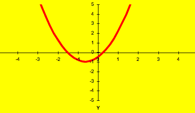
You can download a spreadsheet with the straight line graph, y = mx + c, and two forms of the quadratic graph, y = ax2 + bx + c and y = (x + p)2 + q. The second form of the quadratic helps to explain completing the square like problems, and helps to explain how transforming a graph by scaling in different directions can generate any quadratic graph from the basic y = x2.
- Download the MS Excel spreadsheet
- Download a screen video showing how to use scrollbars in Excel – from FERL at BECTa and produced by Alistair McNaught
- Brief instructions on using Excel for learning – no pictures
- How to build an interactive spreadsheet – 3Mb Word file, not evaluated yet, about using Excel in Maths teaching
- The e-maths Web site looks interesting, and there is a whole page with MS Excel spreadsheets on Maths topics to download as well as a page about using interactive whiteboards .
I use the spreadsheet mainly on a projector in a brief whole class exposition with Access level 2 and GCSE classes. I’d set up (say) a straight line with a gradient of 2 and an intercept of 1, then ask
- what will happen when I increase the gradient…
- and when I increase the intercept….
Next, I have an OHP or a second copy of the straight line worksheet available with a very different graph and ask
- How do I change the gradient and intercept to change the graph on the spreadsheet to look like the one on the OHP?
- What direction and by how much
This all takes about 15 to 25 minutes with directed questioning, examples that include positive and negative intercepts and positive and negative gradients, and a recap. There is then a worksheet with 10 graphs on (copied from the spreadsheet into Word) and the students work in pairs to find the gradient and intercept from the graphs using a simple ‘x step = 1 triangle’ method for the gradient.
I find the projected spreadsheet helps me check the understanding, especially in the negative quadrants (directed numbers being a new concept for most level 2 students). The speed with which new graphs can be set helps people ‘see’ the effect of changes.
If you download the MS Excel spreadsheet here, you will notice that I have fixed the scale on the XY scatter graph that draws the graphs – the graph then moves around a window of definite size rather than having Excel recalculate the scales to fit the data.
Graph plotters like OmniGraph have more advanced and flexible facilities for exploring graphs, and allow you to change the graph formula on the fly, but tend to be harder to set up in my opinion.
This is filed under Maths, ILT. You can follow any responses to this entry through the RSS 2.0 feed. Both comments and pings are closed for this post.
[ bodmas home ]

-
Bodmas features
- RBL Wikispace
- Moodle
- E-learning notes
-
Pages
-
Categories
-
Recent posts
-
Archives
- October 2006
- September 2006
- August 2006
- July 2006
- June 2006
- May 2006
- April 2006
- March 2006
- February 2006
- January 2006
- December 2005
- November 2005
- October 2005
- September 2005
- August 2005
- July 2005
- June 2005
- May 2005
- April 2005
- March 2005
- February 2005
- January 2005
- December 2004
- November 2004
- October 2004
-
Blackboard and DOPA
- Another patent...
- AoC on DOPA
- BECTa advice
- History of VLEs
- Michael Feldstein's blog
-
ILT
- All Things Wiki
- Andy's Black Hole
- Blog Technology blog
- Clive on Learning
- Dick Willis
- EdTechUK
- edugeeks
- FERL @ BECTa
- Fordlog
- Full circle online interaction blog
- Jane's e-learning pick of the day
- Mac OS X tips
- Moodle Training Blog
- moodle.org
- Moodlebug
- MoodleMoot UK
- Open Source Web Design
- Podcasting in Ireland
- Presentation Zen
- Seb Schmoller
- wikispaces
- Yotophoto
-
Journalist Blogs
- Bill Thompson
- BuzzMachine
- Healing Irag
- Kieren McCarthy
- Roy Greenslade
-
Maths
- 2nd July
- Artifacts of Computation
- Blogging for Numeracy
- Casting out nines
- Cut the Knot
- Dotty paper
- Gallery of Computation
- Mathworld
- Numeracy for Health
- Skills Workshop
- Special Graph paper grids
- The Geometry Junkyard
-
Misc
- A Few Things Ill Considered
- Bartleby reference
- BBC Learning Styles survey
- Explorations in Learning
- G24
- Overgrown Path
- Primary Teacher UK
- Real Climate
- UK Phenology Network
- Ways of Knowing
- Wikipedia (English)
- WordPress
-
Playtime
- 55 Ways to Have fun with Google
- GUI Gallery
- Guido Fawkes
- Hitchhiker's Moon
- Inconstant Moon
- Kiev Ephemeris
- Magnatune
- Penny Illustrated News
- Post-Modern generator
- Project Redsand
- Sofa Sound
- Spell with Flickr
- Think Link
- Waterfall 2006
- Wordcount
-
Vital software
- Audacity
- Audio Hijack
- AVG virus checker
- ClamXav
- Disable spotlight
- EasyWMA
- Express Scribe
- LaTeX Equation Editor
- Mellel
- Open Office
- PDFLab
- Processing 1.00 [ beta ]
- Seamonkey
- Smultron
- ST 330 drivers
- Stuffit expander
- Tinderbox
- Vienna RSS reader
- Writeroom
-
Web applications
- Remember the milk
- Resize pictures on the Web
- ScanR
- Score your password
-
Themes
-
Meta
- Login
- XFN
- WordPress
-
Tags
- maths+resources
- maths+teaching
- elearning

![]()
Site delivered by WordPress
© Content Keith Burnett, 2006. This old school table-based layout was devised to support a Web authoring module. Mind you, it loads quicker than Kubrick in Safari...