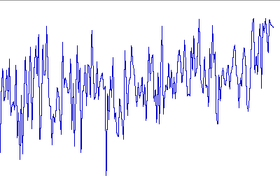
Central England Temperature series

Notice any trend? Upwards? Downwards? Part of a sine wave of longish period? Scribble an idea now, then compare with the full series.
The chart above (shown without axes on purpose) is a plot of the yearly mean temperature from 1800 to 2005 taken from the Central England Temperature series. The series extends from 1659, as reconstructed by Professor Gordon Manley. Some links…
- Datasets/UK Climate/Central England Temperature
- UK Met Office Hadley Centre page
No Responses so far
Comments are closed.
Comment RSS